noworries
MY ROLE
Product designer - User Research, Visual Design, User Flows, Rapid Prototyping
DELIVERABLES
User Research & InsightsUser Flows & WireframesHigh-Fidelity DesignsInteractive Prototype
TIMELINE
07/02/2025 - 08/02/2025
TOOLS
Figma, Adobe Illustrator
THE CHALLENGE
Current anxiety management apps fail to address real-time emotional fluctuations, offering generic exercises that don’t adapt to individual needs.
Key Data:
✔ 1 in 6 adults in the EU face mental health challenges, with women being nearly twice as affected.
✔ Users need immediate, adaptive guidance in moments of distress but struggle to find relevant and effective support.
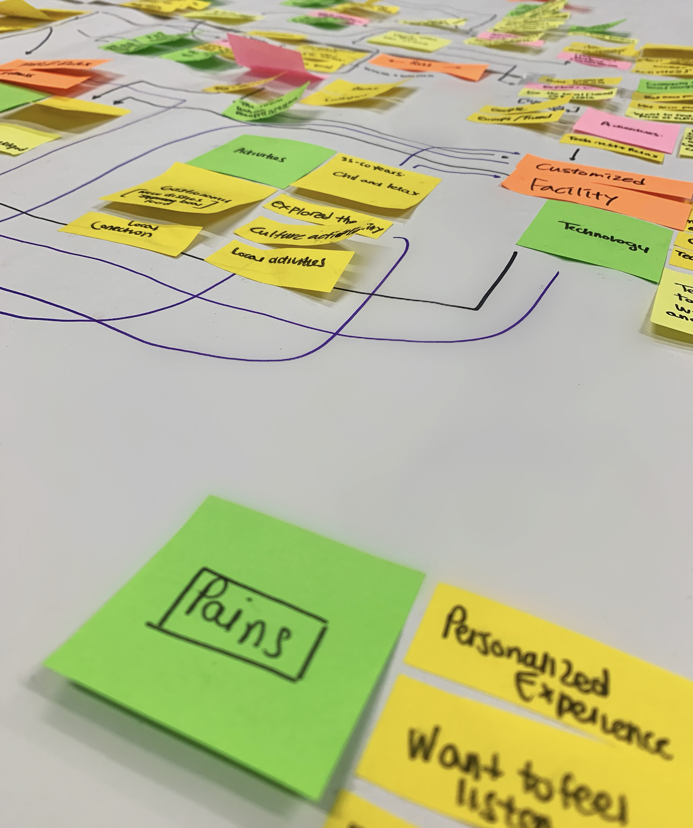
RESEARCH & INSIGHTS
To understand user pain points, we applied a User-Centered Design approach, following key phases:
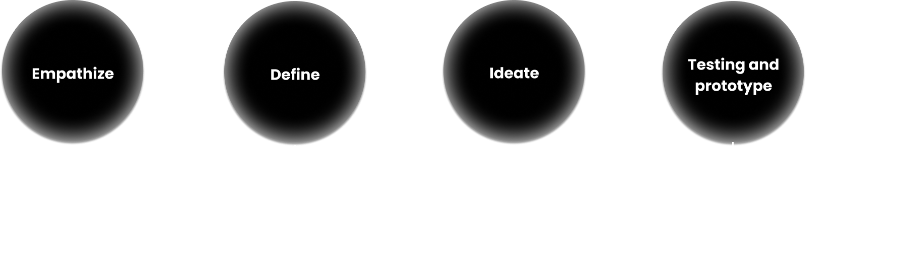
Understanding User Needs & Market Gaps
To understand user pain points, we applied a User-Centered Design approach, following key phases:
Define & Market Understanding
✔ Brief & Secondary Research:
Understanding existing solutions and market gaps.
✔ Competitive Analysis:
Identifying shortcomings in current anxiety apps.
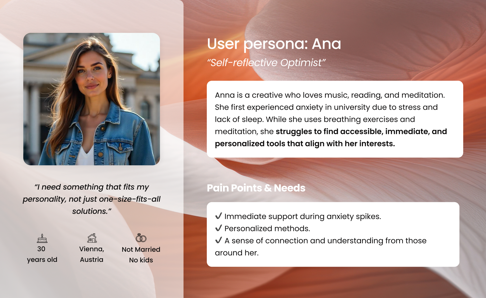
USER PERSONA
User Research & Key Findings
Through user interviews and surveys, we identified critical pain points:
✔ Existing solutions lack real-time adaptability.
✔ Users feel frustrated by generic exercises that don’t match their emotional state.
✔ Many apps track emotions but don’t provide immediate relief during anxiety spikes.
RESULTS
Key takeaways from research
- Lack of Real-Time Support → Users struggle to find immediate help during anxiety spikes.
- Generic & Static Solutions → Most apps don’t adapt to users' emotional states.
- Emotional Disconnection → Users feel misunderstood when seeking support.
Strategic design direction
- The solution must provide instant access to personalized guidance when anxiety escalates.
- The experience should be intuitive, minimizing decision fatigue.
- The design should create a sense of connection and emotional reassurance for users.
HOW MIGHT WE QUESTION
We used a HMW (How Might We) approach to frame the challenge in an open and creative way:
How might we support Anna in managing a severe anxiety episode in real-time when it begins?
This allowed us to explore user-centered solutions and generate actionable ideas to address the problem effectively.
IDEATION & CONCEPT
DEVELOPMENT
With the HMW question in mind, we explored solutions using Crazy 8s, user journey mapping, and wireframing, in order to design a solution with the following requirements:
Immediate access to crisis support with a simple, frictionless interface.
Immediate access to crisis support with a simple, frictionless interface.
A balance between structure and flexibility, allowing users to navigate anxiety management at their own pace.
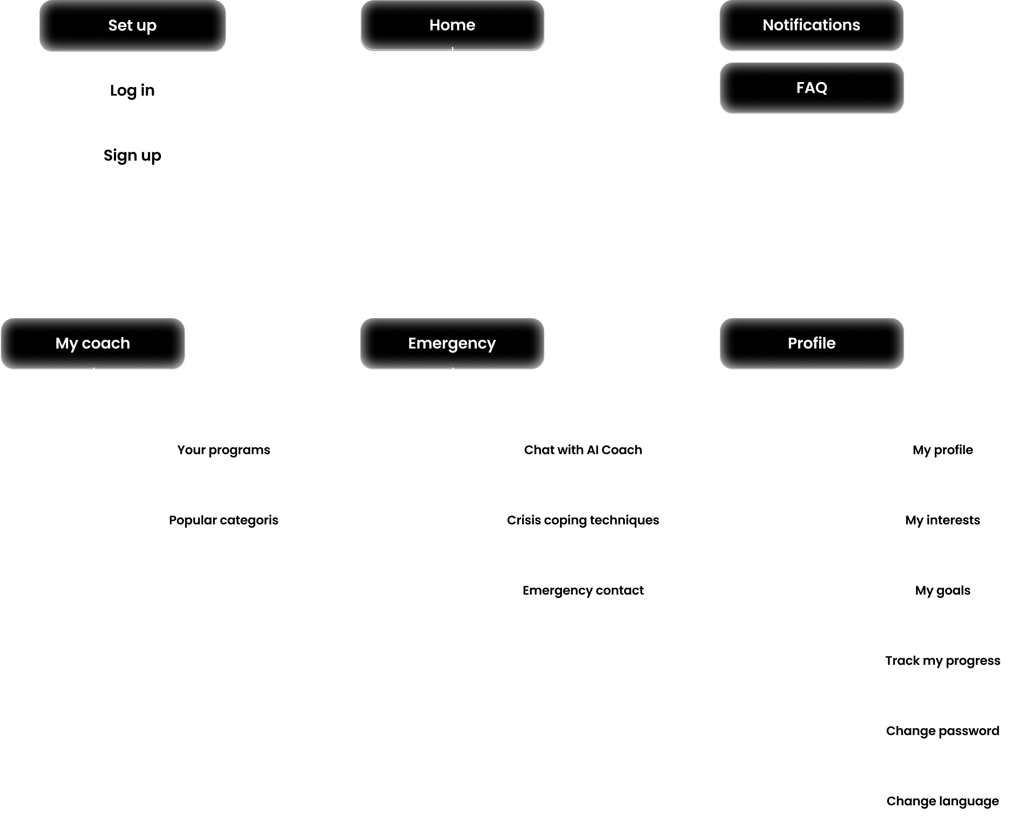
SITE MAP
Structuring the experience to:
- Prioritize quick access to real-time interventions.
- Simplifie navigation flow to minimize cognitive overload.
- Organize features into clear, need-based categories instead of generic exercises.
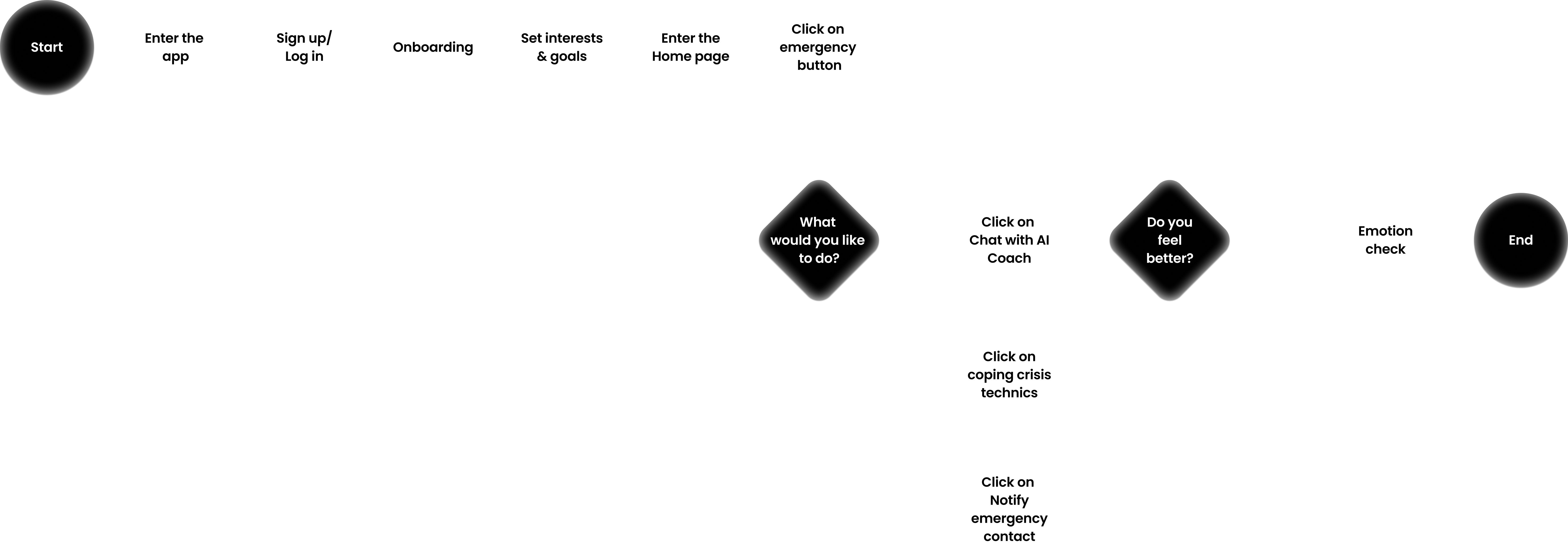
USER FLOW
Mapping out the real-time support experience
- Designed for efficiency and accessibility, ensuring users can reach help in seconds.
- Reduces unnecessary interactions, minimizing the number of taps needed to access crisis support.
- Personalization layers adjust the guidance based on user input.
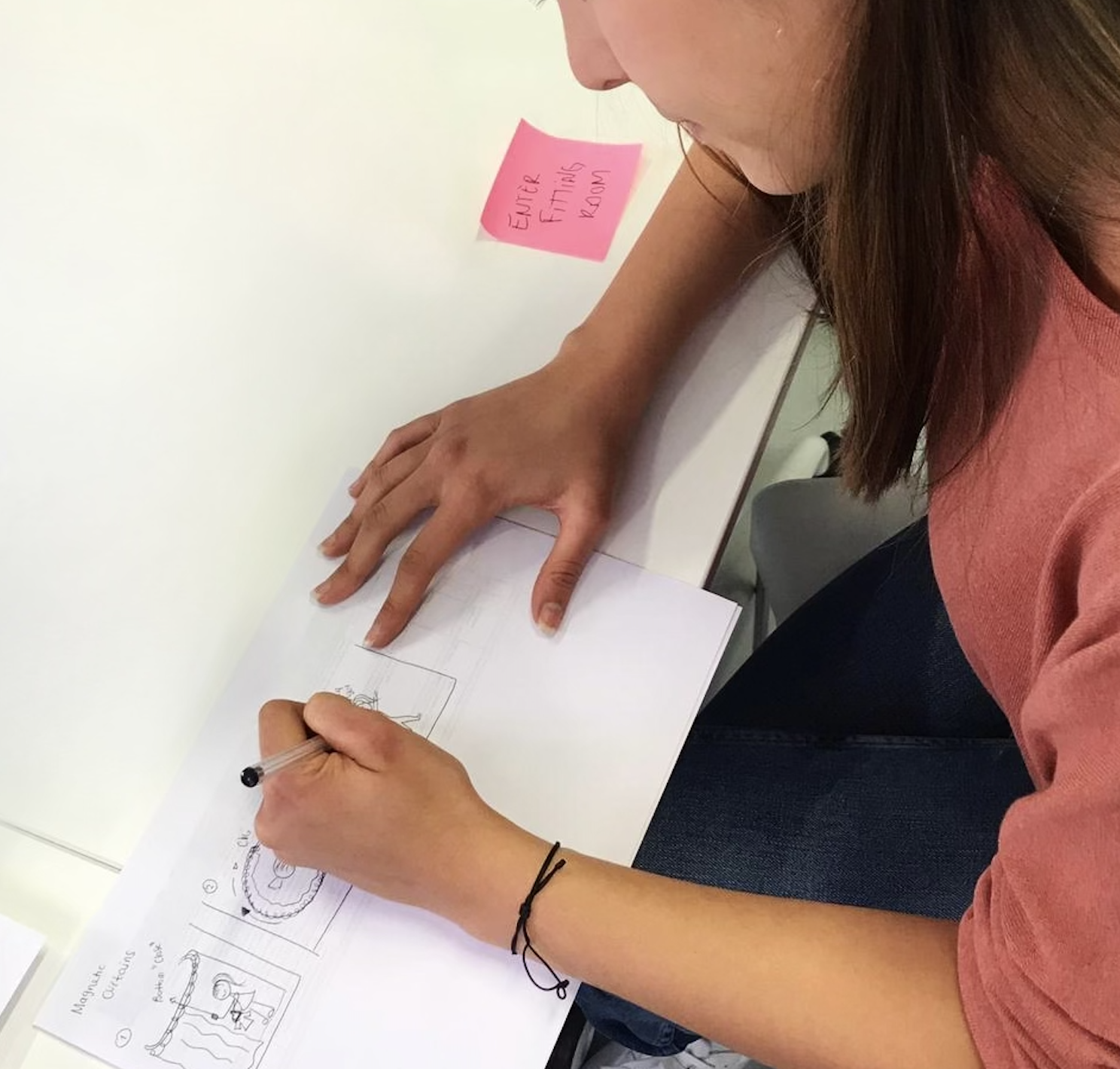
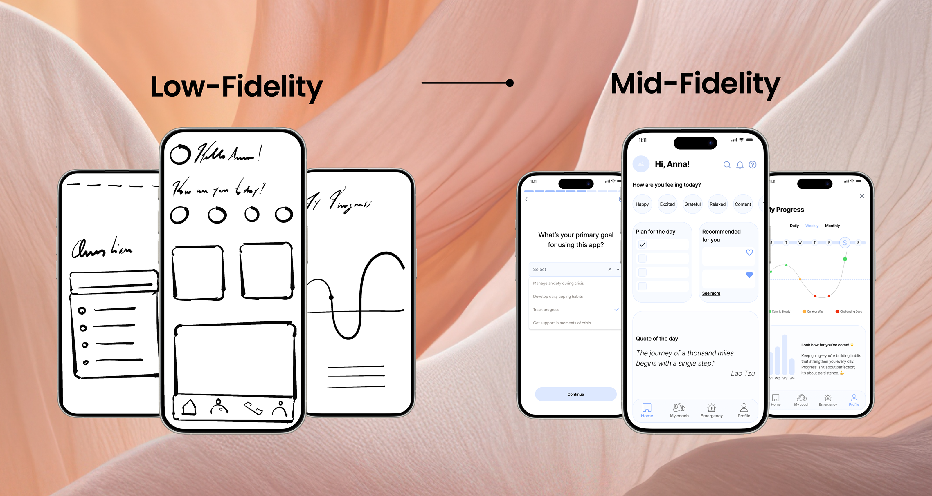
WIREFRAMING & PROTOYPING
We translated our user flows into low-fidelity wireframes to visualize key interactions and test usability early on.
- Low & Mid-Fidelity Wireframes: Focused on information hierarchy and interaction patterns.
- High-Fidelity Wireframes: Final UI, ensuring accessibility, clarity, and emotional impact.
- Prototype & Usability Testing: Iterated based on user feedback to refine interactions and ensure an intuitive experience.
USABILITY TESTING & KEY IMPROVEMENTS
- Registration button was hard to find due to poor placement and size.
- Onboarding felt too long, making users feel frustrated.
- Too many steps in interest selection led to drop-offs.
- Homepage elements lacked clarity, making navigation confusing.Through usability testing, we identified critical friction points in the registration process, personalization flow, and information hierarchy.
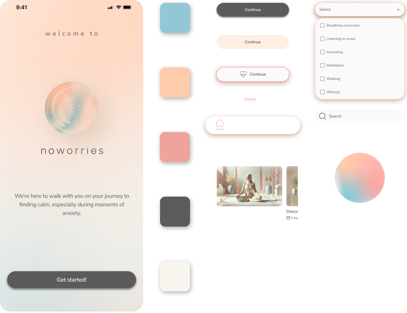
Visual Design
Decisions
Typography: Modern, Friendly, and Approachable
Nunito Sans, with its soft, rounded look, enhances readability and warmth.
Color palette: Every design choice reinforces a sense of calm, support, and mindfulness.
- Soft Blue – Conveys tranquility and emotional stability.
- Warm Peach – Adds warmth and a sense of support.
- Neutral Gray – Brings balance without distraction.
- Light Beige – Provides a soft background that feels natural and calming.
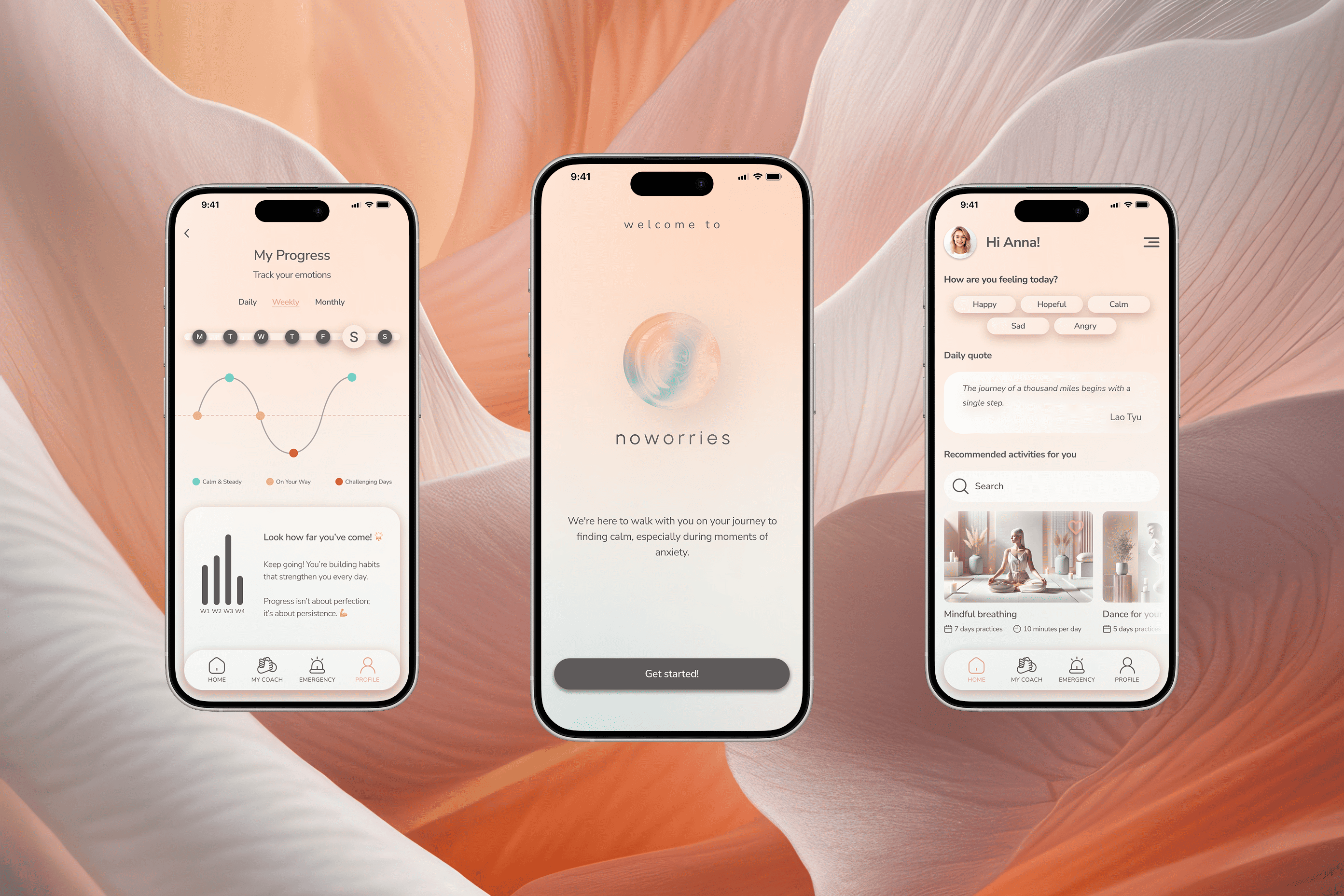
SOLUTION
After defining the visual identity, user flows, and interactions, we created NoWorries—an adaptive anxiety management app that provides real-time emotional support, dynamically adjusting to each user's emotional state for immediate, relevant relief.
✔ Personalized support anytime: AI-guided techniques tailored to your preferences during moments of anxiety.
✔ Progress Tracking:
Identify which techniques help you the most and track your mood over time.
✔ Daily calm:
Daily activities tailored to your interests and preferences.
More projects